
Afterrain Palette – Soft Rain-Inspired Color Theme for Creative Design
A calming, rain-kissed color palette featuring muted blues, grays, and earthy tones for elegant and modern designs.
“Afterrain Palette captures the calm and refreshing feeling of nature after a gentle rainfall. Inspired by misty skies, wet stones, and soft earthy tones, this palette combines muted blues, cool grays, and subtle neutrals to create a balanced and elegant visual experience. Whether you're designing a website, building a brand identity, creating social media graphics, or developing a modern user interface, Afterrain Palette offers a soothing and sophisticated color combination that brings depth, tranquility, and timeless appeal to any creative project. ”
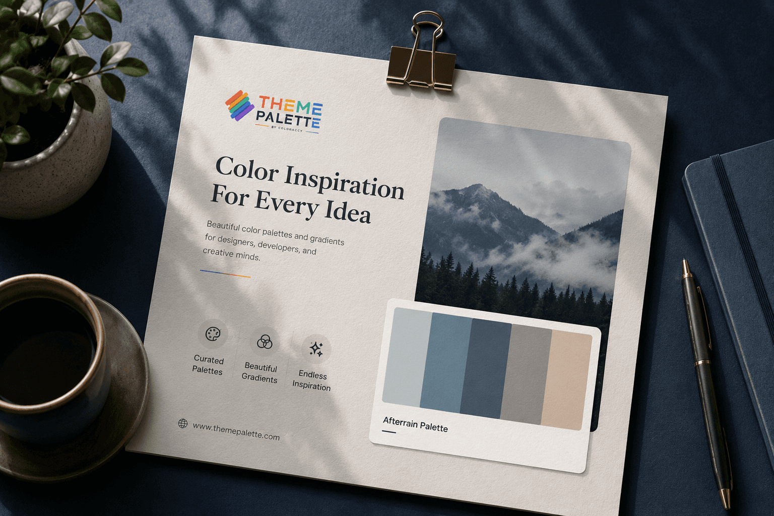
The Afterrain Palette is a thoughtfully curated color collection inspired by the peaceful atmosphere that follows a rain shower. Nature often presents its most beautiful colors after the rain, from cloudy blue skies and mist-covered landscapes to soft gray pavements and warm earth tones. This palette reflects those natural elements, creating a harmonious blend of colors that feels modern, calm, and visually pleasing.
One of the strongest qualities of the Afterrain Palette is its versatility. The muted shades can be used in a wide range of design projects, including website design, mobile applications, branding materials, presentations, illustrations, and digital marketing assets. Unlike highly saturated color combinations that can overwhelm users, the Afterrain Palette delivers a subtle and professional appearance that improves readability and user engagement.
For web designers and UI professionals, these colors are particularly effective because they help create clean interfaces with a relaxing visual hierarchy. Soft blues can be used for primary actions and highlights, while neutral grays provide balance and structure. The earthy tones introduce warmth, making the overall design feel more human and approachable.
Branding professionals can also benefit from the Afterrain Palette. Businesses that want to communicate trust, creativity, stability, and sophistication often choose soft and natural color schemes. The palette works exceptionally well for lifestyle brands, creative agencies, wellness companies, interior design studios, photography portfolios, and technology startups seeking a premium and minimalist identity.
The palette's rain-inspired aesthetic also makes it ideal for storytelling and content creation. Designers can use these colors to evoke feelings of freshness, reflection, peace, and renewal. Social media graphics, digital advertisements, blog illustrations, and presentation slides become more engaging when supported by a cohesive and emotionally resonant color scheme.
Another advantage of the Afterrain Palette is its accessibility and adaptability. The balanced contrast between the colors allows designers to create visually appealing layouts without sacrificing readability. Whether used in light themes, dark themes, or gradient combinations, these colors maintain their elegance and consistency across different screens and devices.
Ultimately, the Afterrain Palette is more than just a collection of beautiful colors. It is a design resource inspired by the quiet beauty of nature and the calming atmosphere that follows rainfall. By incorporating these sophisticated tones into your projects, you can create experiences that feel modern, balanced, and emotionally connected, helping your designs stand out while maintaining simplicity and timeless appeal.
Key Benefits
Website and Landing Page Design
Create elegant and modern websites with calming color combinations that improve user engagement and readability.
Brand Identity Development
Build sophisticated logos, brand guidelines, and visual identities that communicate trust, creativity, and professionalism.
Mobile App User Interfaces
Design intuitive mobile applications with balanced color schemes that enhance usability and visual comfort.
Social Media Content Creation
Develop visually cohesive posts, stories, and marketing graphics with a modern and refreshing aesthetic.
Presentation and Portfolio Design
Produce professional presentations and creative portfolios that stand out through clean and harmonious color combinations.
Creative and Editorial Projects
Apply the Afterrain Palette to digital illustrations, magazines, mood boards, and storytelling projects that require a calm and contemporary visual identity.
What's New in this Release
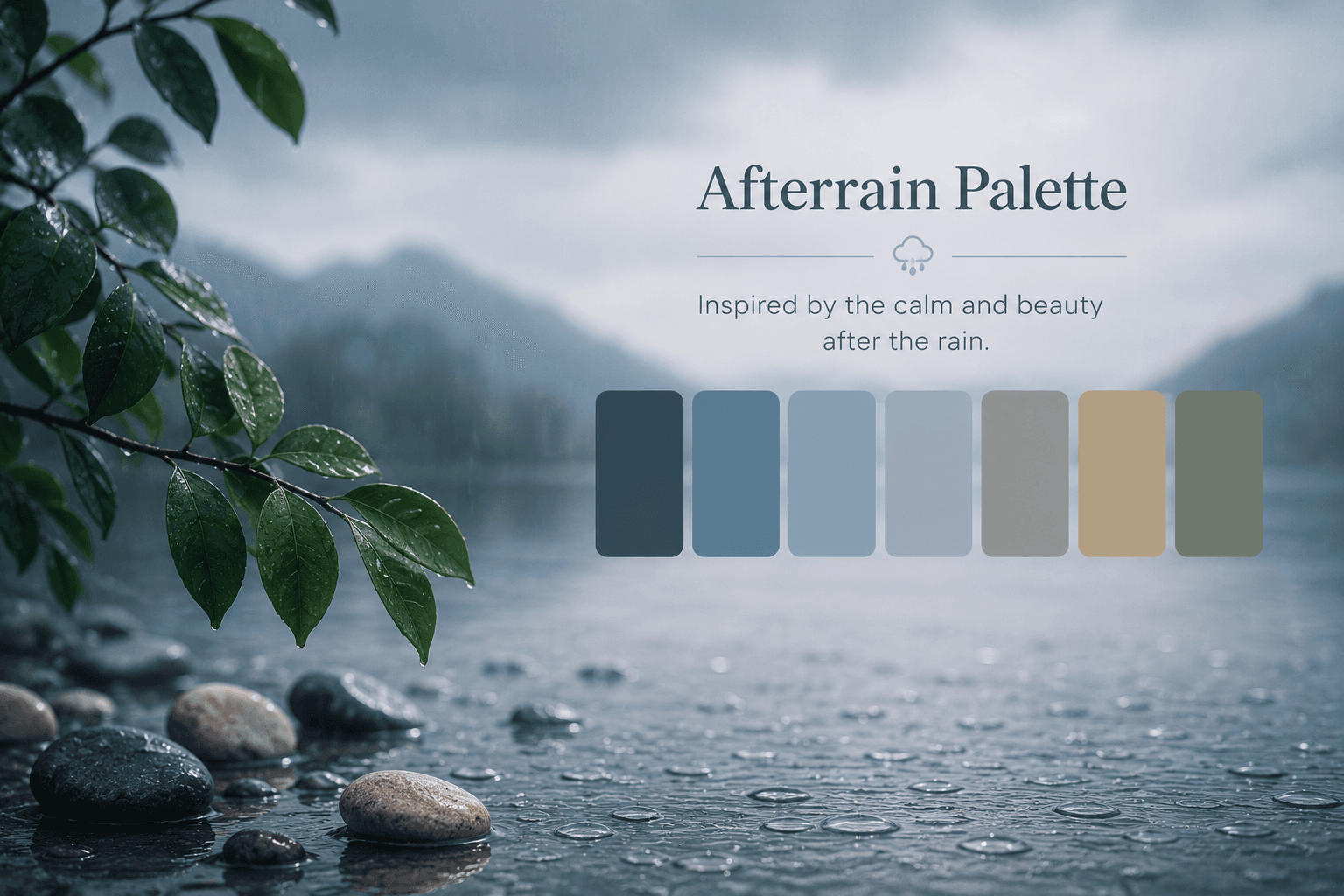
Rain-Inspired Soft Color Harmony
The Afterrain Palette introduces a calming blend of misty blues, cool grays, and soft earth tones inspired by the peaceful atmosphere after rainfall. This harmonious color combination helps designers create elegant, modern, and emotionally engaging digital experiences. The palette is ideal for websites, branding projects, presentations, and creative portfolios that require a clean and sophisticated aesthetic.
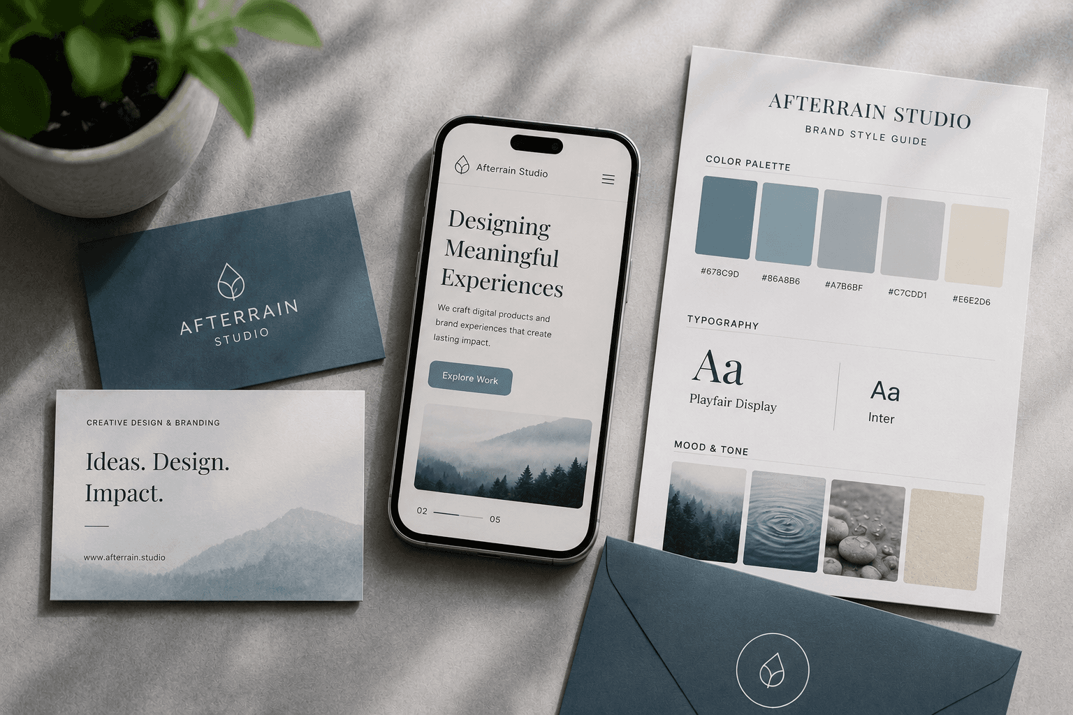
Enhanced UI and Branding Versatility
The Afterrain Palette has been optimized for user interface and branding applications. Its balanced contrast and muted tones improve readability while maintaining visual appeal. Designers can easily apply the palette to mobile apps, dashboards, marketing materials, and brand identities, creating professional designs that communicate trust, creativity, and simplicity.
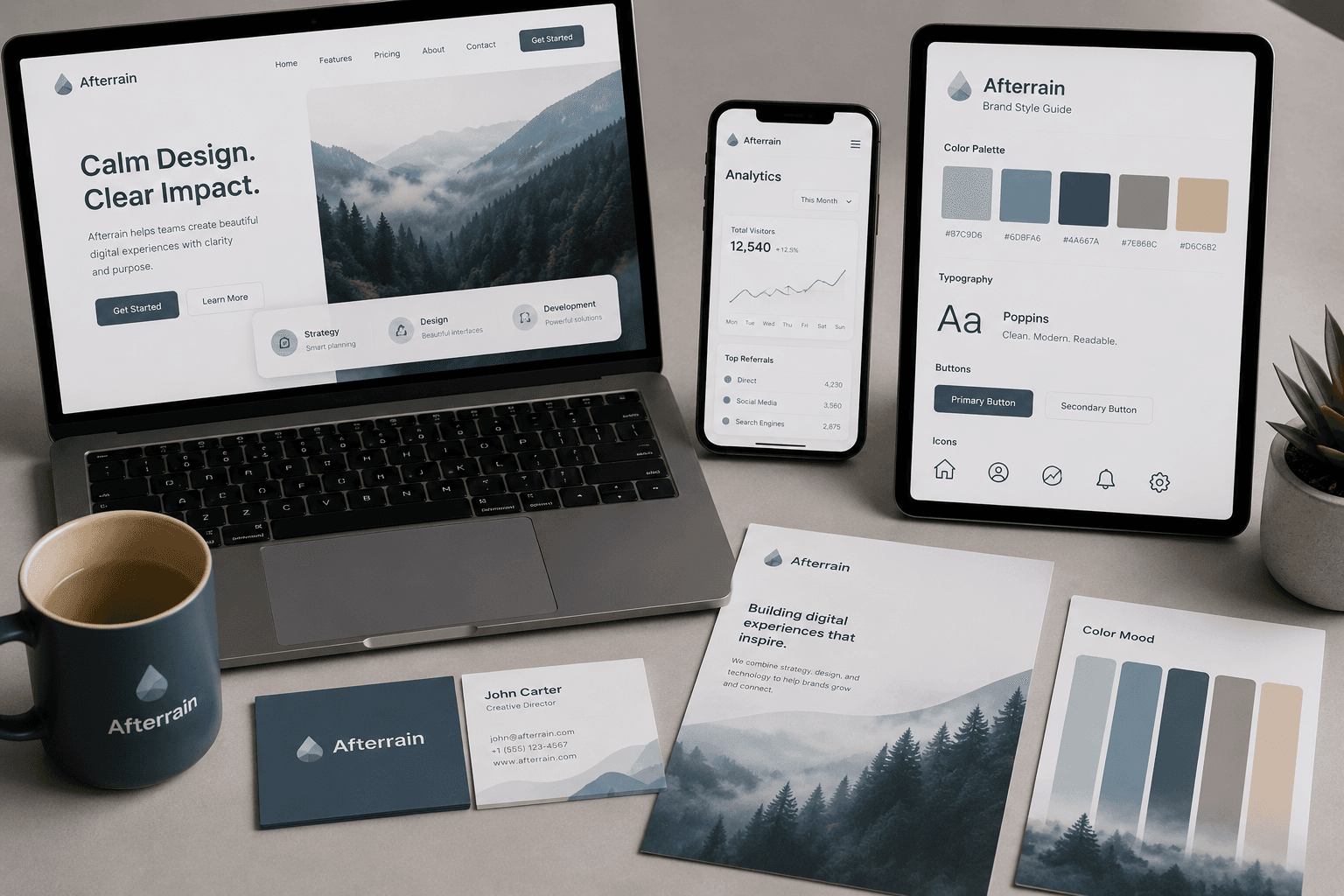
Modern Minimalist Design Inspiration
Inspired by cloudy skies and refreshing post-rain landscapes, the Afterrain Palette offers timeless design inspiration for creative professionals. The carefully selected colors work beautifully in both light and dark themes, making them suitable for contemporary web design, social media graphics, digital illustrations, and storytelling projects that aim to evoke calmness, renewal, and sophistication.
Key Features
Calm and Professional Visual Appeal
Create elegant and modern designs with soothing rain-inspired colors that improve user engagement and deliver a clean, professional appearance across digital platforms.
Versatile Design Applications
Use the Afterrain Palette for websites, mobile apps, branding, presentations, social media graphics, and print materials with consistent visual harmony.
Enhanced User Experience
Balanced color contrast and soft tones improve readability, visual hierarchy, and usability, helping designers build intuitive and comfortable interfaces.
Timeless Minimalist Aesthetic
Combine contemporary minimalism with nature-inspired elegance to create designs that remain visually appealing and relevant over time.
Emotional Brand Connection
The muted blues and earthy neutrals evoke calmness, freshness, and trust, allowing brands to establish stronger emotional connections with their audiences.
Creative Storytelling Support
The Afterrain Palette provides a sophisticated visual foundation for storytelling, enabling designers to communicate creativity, renewal, and authenticity through color.
Core Use Cases
Website and Landing Page Design
Use the Afterrain Palette to create clean, modern websites and landing pages with calming color combinations that improve readability and user engagement.
Brand Identity Development
Build memorable brand identities, logos, and style guides using sophisticated rain-inspired tones that communicate trust, creativity, and professionalism.
Mobile App User Interfaces
Design intuitive and visually balanced mobile applications with soft colors that enhance usability and provide a comfortable user experience.
Social Media Content Creation
Create cohesive social media posts, banners, and marketing graphics with a refreshing and minimalist aesthetic that strengthens brand consistency.
Presentation and Portfolio Design
Develop professional presentations, pitch decks, and creative portfolios that stand out through elegant and harmonious color combinations.
Digital Illustrations and Mood Boards
Apply the Afterrain Palette to illustrations, mood boards, editorial projects, and creative storytelling content that requires a calm, contemporary, and nature-inspired visual identity.